End users can access your app from different devices such as phones, tablets, laptops, and desktops with large monitors, different screen sizes, and with varied number of pixels.
To ensure great user experience and usability of the app on each form factor and device, designing the app with responsive design principles is necessary.
Why should you build responsive apps
End users can access your app from different devices such as phones, tablets, laptops, and desktops with large monitors, different screen sizes, and with varied number of pixels.
To ensure great user experience and usability of the app on each form factor and device, designing the app with responsive design principles is necessary.
Designing the app with responsiveness principles
Before you start designing the UI for your app, you need to consider the following aspects:
- What form factors or devices do you want to support.
- How the app should look on each form factor?
- What elements of the app need to stretch or resize?
- Are the elements hidden on some form factors?
Before you start using the responsive layouts, you need to do the following:
- Go to Power Apps
- Open the app where you want to use the responsive layout.
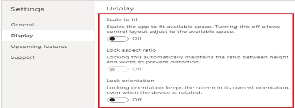
- Go to Settings > Display to disable Scale to fit, Lock aspect ratio, and Lock orientation and select Apply.
Scale to fit
This setting is on by default so that app screens resize to fit the available space on the device. When this setting is on, the app’s Width property matches its DesignWidth, and the app’s Height matches its DesignHeight.
If you turn this setting off, the app adjusts to the aspect ratio of the device on which it’s running and takes up all of the available space.
Lock aspect ratio
When this setting is turned off, Lock aspect ratio is automatically turned off and disabled. In addition, the Width property of all screens is set to Max(App.Width, App.DesignWidth), and their Height property is set to Max(App.Height, App.DesignHeight) so that they track the dimensions of the window in which the app is running. With this change, you can create apps that respond to different devices and window dimensions.
Use formulas for dynamic layout
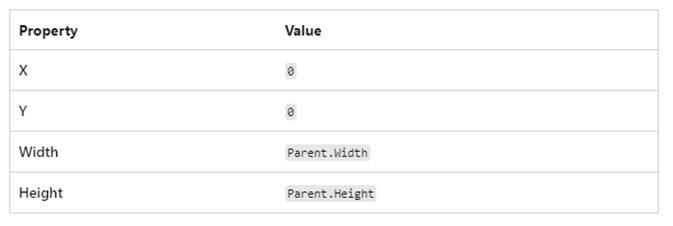
To create a responsive design, you locate and size each control by using formulas instead of absolute (constant) coordinate values
These formulas use the Parent operator. For a control placed directly on a screen, Parent refers to the screen.
Galleries
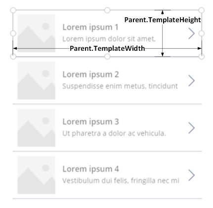
If you use a gallery in your app, you’ll need to lay out controls within the gallery’s template. You can position these controls by writing formulas that use the Parent operator, which will refer to the gallery templateuse.
the Parent.TemplateHeight and Parent.TemplateWidth properties; don’t use Parent.Width and Parent.Height, which refer to the overall size of the gallery.
Example for auto-layout container
To build a responsive screen:
- Create a blank canvas app with Tablet layout.
- Select Settings > Display and disable Scale to fit, Lock aspect ratio, and Lock orientation and select Apply.
- Select Settings > Display and disable Scale to fit, Lock aspect ratio, and Lock orientation and select Apply.
Auto-layout containers
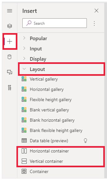
Two controls, Horizontal container and Vertical container can be used to automatically lay out the child components. These containers determine the position of the child components so that you never have to set X, Y for a component inside the container. Also, it can distribute the available space to its child components based on the settings, as well as determines both the vertical and horizontal alignment of the child components.
When to use auto-layout containers
You can use auto-layout containers in the following scenarios:
- UI needs to be responsive to screen size or form factor changes.
- There is more than one child component that needs to resize or move around based on the screen size or form factor changes.
- When you need to stack items vertically or horizontally (regardless of their size).
When you need to space items evenly on the screen.
Responsive layouts
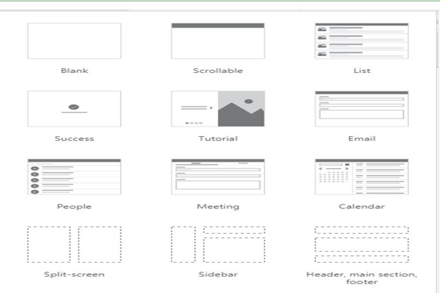
The following responsive layouts can be created by adding a new screen and selecting the appropriate option from the Layout tab:
The new responsive layouts are available to the apps formats but the new screen templates are available only for Tablet format.
Screen sizes and breakpoints
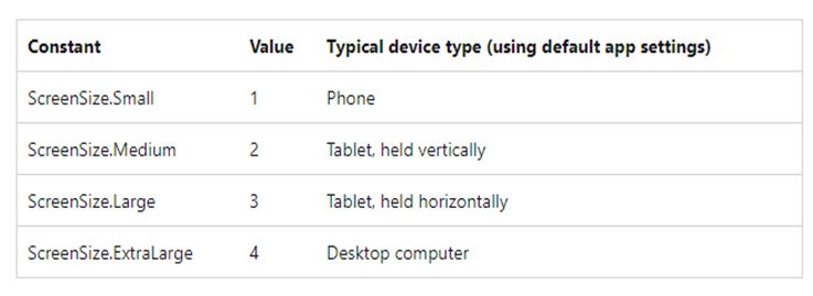
You can adjust your layout based on the size of the device. The screen’s Size property classifies the current device size.
Custom breakpoints
The screen’s Size property is calculated by comparing the screen’s Width property to the values in the app’s SizeBreakpoints property
- app created for tablet or web, the default value in the app’s SizeBreakpointsproperty are [600, 900, 1200].
- app created for phones, the value is [1200, 1800, 2400].

